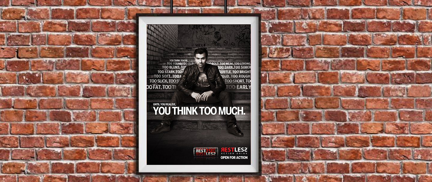
UI/UX

Digital

User interface doesn’t sound very personal, yet it is. It’s the way people experience everything in the online world. Each click of a mouse or tap of the keyboard is a conversation with the brand. An opportunity to build a connection and an appreciation when you have 100% of the audience’s attention.  

The Washing Bay

Brand

TASK

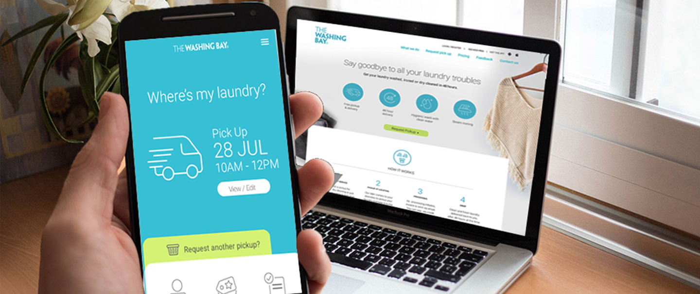
DDW helped launch the first-of-its-kind Laundromat in Mumbai, The Washing Bay. The challenge was to communicate the value propositions effectively and differentiate the brand from the dry cleaning services.

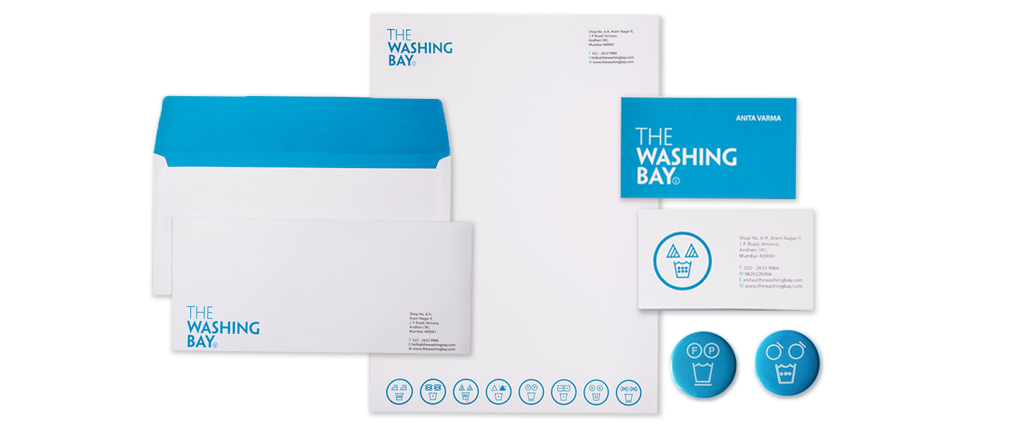
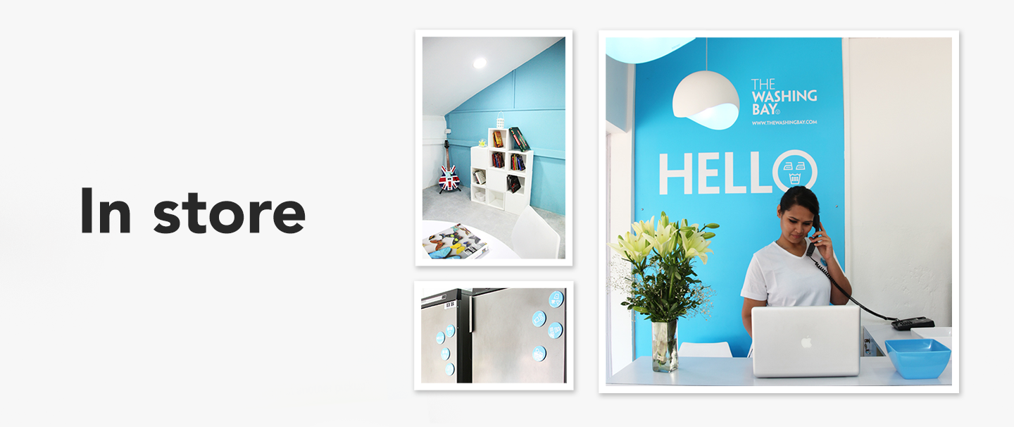
DDW was involved from the inception – from the naming to the identity (both verbal & visual) , brand strategy and ambient design.

APPROACH

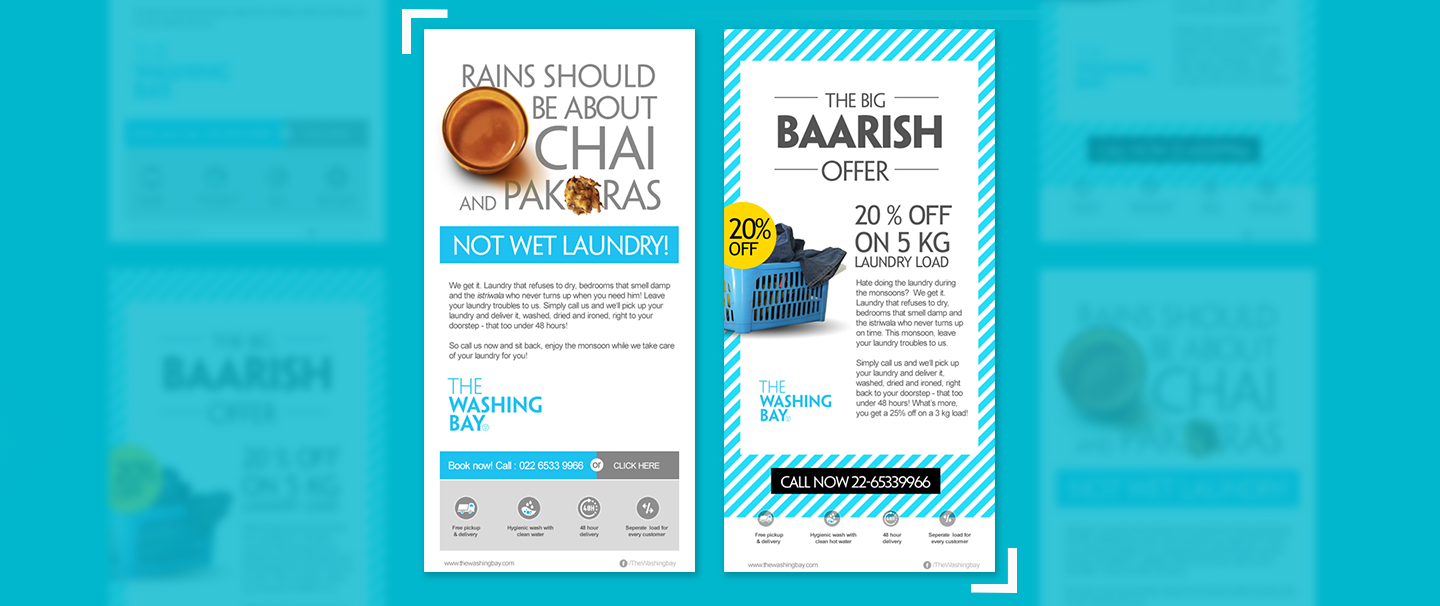
Targeted mainly at the singles & ultra-busy couples, with hectic work schedules, the brand  promise was to ease the burden every-day laundry.  The identity simply had to be very inviting ,fun and refreshing. It also had to be clean and neat just like fresh laundry. 

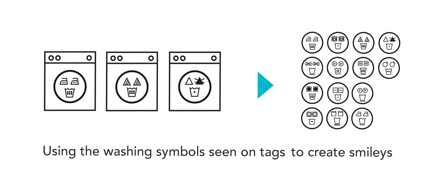
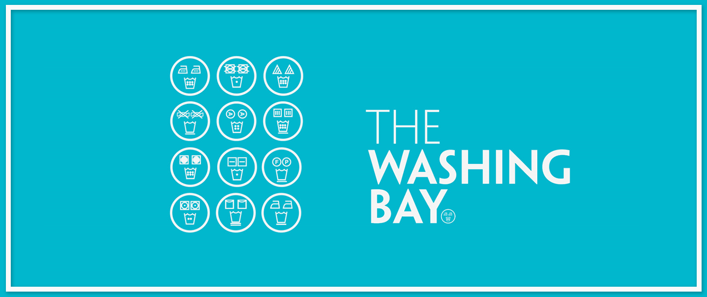
The approach we took was of HAPPY MORNINGS.
The extended part of the identity graphically shows happy faces with the washing instructions, introducing the instructions in more fun and user -friendly manner. The branding of the identity and space together reflect a cool yet very practical and functional setup.

Art Hop

Brand

Design

TASK

A young energetic duo, Aalok & Varsha came to us with an idea of a multi-faceted event in Bandra. An event that involved Art, perfomances, workshops spread over multiple venues in Bandra. The task at hand was to develop an identity that would reflect the dynamic and creative ethos of the event itself.

APPROACH

The unique part of the event was that while it was local it was spread across multiple venues. The idea was that people could hop over from one venue to another for a different experience. The identity had to be vibrant, approachable and fun.

Ideation on the theme and the brand name led to a very simple motif that very simply reflected what the event was all about. The footprint. 
Walk around. Explore. Get inspired. 

The rendering of the logo was in a rough sketch style. 

That’s Personal

Brand

TASK

The challenge: India’s first ever adult e-store was to be launched. Needless to say, the challenge was to build a brand that reflected a clean image (despite the category), connoted privacy, and was broad enough to encompass a wide range of products that they might sell in future. 

APPROACH

Create a brand is unapologetic, in the sense that it’s extremely comfortable and confident about its raison d’être,  At the same time, the url had to be easy to recall too.  That’s Personal.com brilliantly appropriates the product line & the privacy aspect with the right attitude.  It says private without saying illicit or forbidden. 

The brand persona exudes a sense of fun, sexiness and a wee bit of rebellious
– enough to get people to raise their eyebrows but yet approve of it. The logo reflects just that with the semi colon appearing before the P, forming the wink. 

VIR

Brand

TASK

VIR aims to enhance, and enrich the lives of armed forces personnel and their families from inception of service to post-retirement life in each aspect of their personal and professional lifestyle. VIR is a business-driven social change that will deliver value to those who give the best years of their life in service of the country. Task was the brand development and visual identity development for this noble enterprise.

APPROACH

From guarding the siachen to disaster relief to riots, the indian armed forces are always ready. But the indian soldier also has to wage wars of a different kind. From non-commensurate pay to the challenges of early retirement, the Indian soldier faces huge obstacles. It’s time they got their due. 

Native Tongue

Brand

TASK

Ruchira Sonalkar is a chef extraordinaire. She along with her husband Rohan had a brand called Jam Packed –  homemade preserves , spreads and more.  As the brand evolved, they felt that the name was restrictive and not very scaleable.

APPROACH

An intensive brand immersion later, we arrived at a new Brand name, idenitty and packaging that resonated with how Ruchira approached her products and her brand. 

The brand is inherently desi and yet has a contemporary twist to the recipes. The brand name Native Tongue summed up eveything we wanted to say about the brand in a memorable, easy to recall way. Using devnagri to highlight the “desiness” but in a very modern design language.

Restless Action Drink

Communication

digital

TASK

DDW helped Restless Action Drink position itself and set a context to the brand story.
The challenge was to differentiate the brand story from those of the competitors  & establish a frame of reference for the brand. DDW was involved from the positioning to the creative strategy and implementation of the creatives.


APPROACH

As Restless was already positioned as an Action Drink (and not an energy drink),
we decided to amplify the same. Open for Action became the brands mantra.
For the campaign, the insight that we worked on was that most of us have dreams, things we’ve always wanted to do but somehow never got around to doing it. And we also make excuses for not doing the same. We keep thinking of excuses and reasons for not doing the thing we really want to do.

It was time someone reminded us and told us to stop making lame excuses. Restless therefore would be that brand that encouraged people to stop thinking and start doing.

LinkedIn

Communication

TASK

Marketing support for products as well as B2B.

Klay Capital

Brand

TASK

Klay Capital Limited was set up to provide a credible alternative to traditional wealth management relationships. They aimed to offer advisory solutions which are truly independent, highly personalized, client centric investment advice, through a team of skilled and seasoned client advisors.


APPROACH

The overall design approach had to showcase the brand as classy, modern and elegant. Since we were talking to an elite audience, we recommended a minimalist approach to the logo and not have the logo spell out finance or the industry.

Monograms have been used to connote exclusivity, fine workmanship and attention to detail since ages. The following concept uses the letter K to form a simple, elegant but modern monogram for the logo mark. The approach was to be understated and non-obtrusive, yet unique just like the brand is.